So you’ve run your first simulation and you got the pretty chart. But what does that thing mean? Let’s break it down.
There are two main parts to the chart: the blue bar chart and the pink line chart.

The Blue Bars
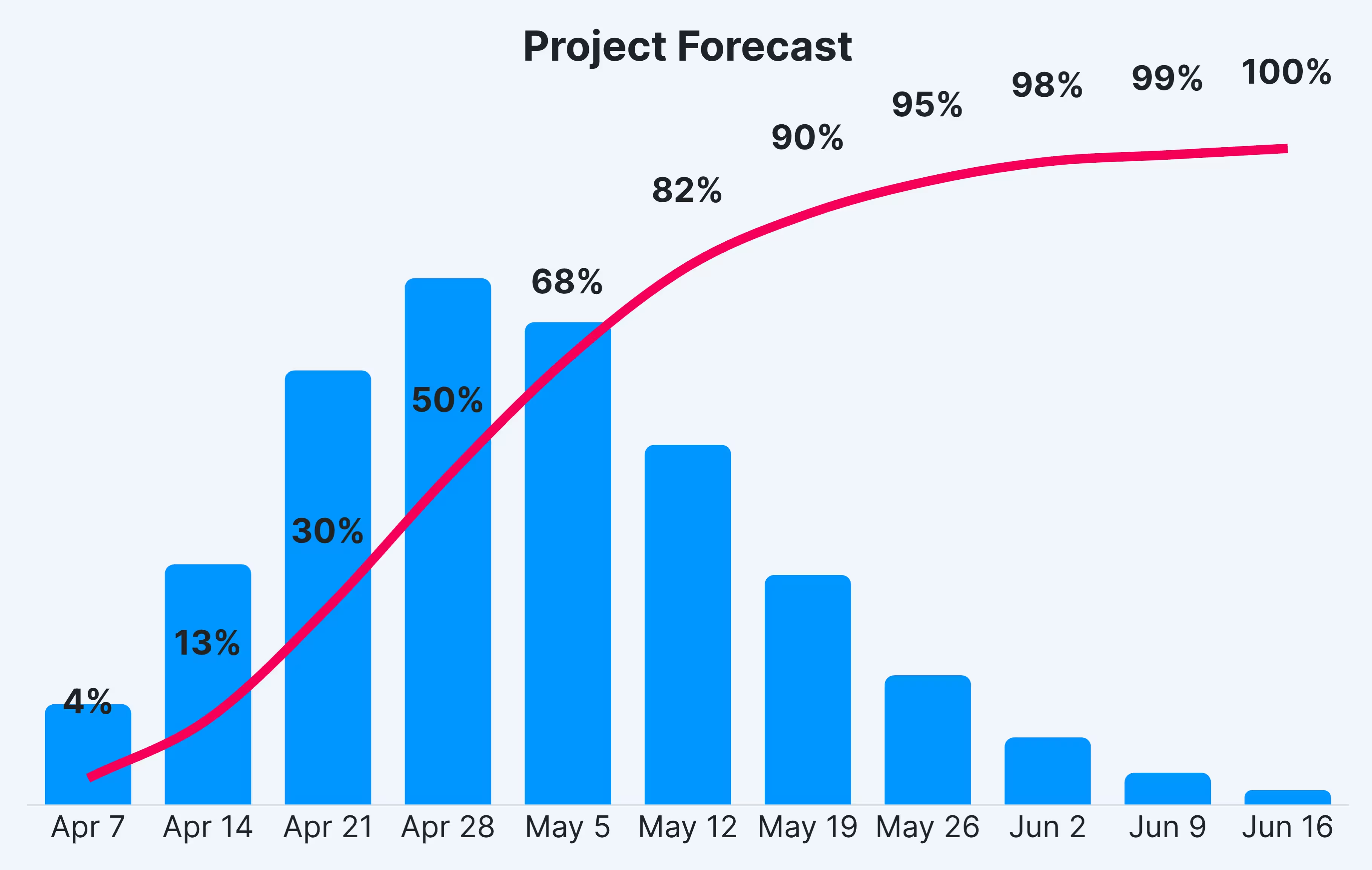
Each bar in the blue bar chart represents relatively how many of the simulations ended on that date. The more simulations that end on a given date, the larger the blue bar.
So reading the chart below you can see that tallest bar is on April 28th. This means that more simulations ended on that date than any other. The bar on June 16th is the shortest, meaning the least amount of simulations ended on that date.
Another way to interpret that is that the project is most likely to end on April 28th and its least likely to end on June 16th.
The Pink Line
The pink line represents the percentage of simulations that ended on or before a given date. You can see that 95% of the simulations ended on or before May 26th.
The pink line percentage is useful for answering questions like “What are the chances the project will be done by X date?” In this case, the pink line shows that there is a 95% chance the project will be done by May 26th. That percentage can represent your confidence in the project finishing by that date.

A Date and a Confidence Level
You’re looking for a date with an associated confidence level. The quickest way to get a confidence level is to look at the pink line. Find the percentage that is closest to the level of confidence you want. In this example, if you’re looking for 90% confidence, the date would be May 19th. 100% confidence would be June 16th.
Remember, this is a probabilistic model. There is no guarantee the project will end on that date, but these are the most likely dates based your historical data.
